

Jeff Clark is a book designer based in Ypsilanti, Michigan, who works under the moniker of Crisis Studio. We often exchange texts to gossip about typefaces and graphic design. Browsing through those conversations, I thought they would make a nice contribution to this newsletter, a behind the scenes look at the process and context of book design. But upon further reflection we realized they might be a little too raw and revealing. So instead, we started fresh and wrote each other back and forth over the course of several days at the end of August. Here, Jeff responds to an earlier post, Raw Material: On the colophon.
Kevin Yuen Kit Lo: Hey J, so what did you think of the colophon piece? Is it clear what I was trying to get at?
Jeff Clark: I think it was clear, yes, and I too have sometimes loved a colophon. More often than love, though, I’ve disliked a colophon. There are two main reasons for this:
The first is that so many of them are copy/pasted from one shitty book to the next, by trade publishers, the very same publishers who print their books on the cheapest possible paper, and whose interest in publishing is money not culture. Do David Sedaris’s readers need to know that his unremarkable book has been typeset in Sabon (in India)? I don’t think so.
The second reason I’m sometimes put off by colophons is that they’re a hallmark, annoyingly detailed, of “fine press” editions, and I’ve been looking askance at the book arts for a long time. Some guy with a beard and an apron runs a little shop that produces limited edition, letterpressed books, and he obsesses over all the details of the design and composition and printing of, let’s say, a story by Melville. When he’s all done, some rich people buy a few copies, and a bunch of libraries buy the rest. And in time his work becomes coveted by collectors, and eventually he dies, with a pipe by his bedside, in a lovely house out in the woods somewhere in the northeast, and he’s done nothing whatsoever to change the world. Instead, he’s produced some immaculately crafted, small-run editions of writing the world already has too much of.
Your colophon is loveable, on the other hand, because you’re not that bearded fellow printing D.H. Lawrence on Rives BFK so that the special collections librarian at the Beinecke will send you $11,000 for copy number 7; you’re a radical designer who’s hijacking the dusty colophon format to draw attention to some marginal type designers and publishers. Right? And just one further question—but first, a quote from your essay:
“[The colophon] humbly acknowledges the collaborative labour and material origins of the book in counterpoint to individual authorial genius or claims to rights of exploitation and ownership. It expresses an ethics of craft.”
But what if the materials I’m able to use are pedestrian, the print shops conservative and mediocre, and the writing in the book has nothing to do with countering oppression? Like, I’m often bummed my studio is even credited in these books. I’m definitely not going to augment this design-selfie by saying the book in hand was printed by CJK Group Inc. on 55-pound Glatfelter B-18. And as we discussed via text, I’m often not going to list the type I used in the book, because there’s a good chance I’ve borrowed it.
KYKL: I agree with your points in terms of how the colophon is most often deployed in practical terms. I read a bunch about how it was primarily used as a marketing tool with the advent of trade publishing, and obviously it also reads as a marker of occultish elitism, a peek into the old boy’s club.
I guess I was thinking of the colophon more idealistically, philosophically, as an important callback to the book as a material object, to the material conditions of its production and all that might entail given this age of free-floating signifiers we’re living in. Even (and maybe especially) if those materials are mediocre? Could that be subversive in some way? Or at least truthful.
And of course there’s the pedagogic and kinda poetic aspects that I find valuable, that potent moment right before closing a book. No doubt I’m being a bit romantic here, and maybe that’s not what we need in these times, but I can’t really help it.
Besides, I love me some Sabon. Our man Tschichold has a story to tell about fascism, utopian modernism, and his own reform.
JC: By pedagogic and poetic, you mean that my disclosing elements of a book’s design will maybe one day be useful to another designer? I guess that could be marginally so (I save them a half hour of font sleuthing by stating that I’ve set the book in Selva and Jungka). If I were to tell them the book was printed on 55lb Rolland Enviro by Friesens in Manitoba, I suppose that helps them a bit if they want to replicate the material embodiment of this particular paperback. I just can’t imagine crafting a prosaic design note on the last page of the book, and this must have to do with my distaste for the designer class, and with any convention participated in by that class, any statement issued by this class; I’d rather sneak in and out of a book, and leave the reader with a clean, organized set of pages through which to engage with the writing. I hate to be in resonance with Beatrice Warde’s notion of The Crystal Goblet, but after 28 years spent designing books, I think I’m coming to terms with the fact that my socially subversive work doesn’t often happen in my paid design work, but rather in my off-hours.
I love how you describe those final moments before putting down a book (for good?) as potent. That really resonates with me. A colophon is like a stranger running up to someone who’s grieving (or smiling, etc.) on a sidewalk and whispering, “I have participated in your sorrow” (or joy, etc.). Are we adding to a reader’s literary experience if we intrude in this way? Imagine someone reading the final sentence of a trenchant new book, exhaling deeply, then turning the page and finding this:
This book has been designed by Replicant/Projects and typeset in Quadraat and Circular. About Quadraat, its designer, Dutch researcher and typographer Fred Smeijers, writes, “Quadraat combines Renaissance elegance with contemporary ideas on construction and form.” While its roman feels handsome and almost technically perfect, its italic is problematic enough that we tend to avoid using it for books that feature a lot of italicization. Replicant/Projects purchased an early version of Quadraat in the 1990s, but we’ve since had to steal updated versions of the typeface because money is so tight. Circular is a sans serif family from the Lineto foundry, and in the words of designer Laurenz Brunner, “Circular’s design evolved from a purely geometric approach to a more complex formal conception by the time of its 2013 release. The result is a geometric sans serif that marries purity with warmth and strikes a balance between functionality, conceptual rigour, skilled workmanship and measured idiosyncrasy.” While Replicant/Projects ordinarily scoffs at any capitalist enterprise that references “purity” and “warmth” with regard to something they’re trying to sell, we’re quite taken with Circular’s lowercase t’s. Lineto’s fonts are so expensive we assume they’re meant to be used only by corporations/corporate design firms, so we sourced it for free from a friend in Lithuania. It’s likely we’ll never use it again. The book was printed on 60lb Glatfelter B-18 Natural by Sheridan Books of Chelsea, Michigan, a book printer that was recently purchased by a conglomerate called CJK Group, who’ve been acquiring, shuttering, and liquidating the assets of book printers across the midwest. We had to use Sheridan because our client insisted. Sheridan’s work tends to be mediocre, and some of the managers in their customer service department are extremely difficult to work with.
About Tschichold: tell me how you interpret his aboutface regarding New Typography?
KYKL: Hahah, good one. But snark and cynicism aside, from an ideological perspective, I would actually love to read a colophon like this. It comes back to placing the book (and the reader) in the world, with all the fucked-updness of existing and making under neoliberal capitalism. It is essentially an argument against Warde’s Crystal Goblet, against the endless smooth flow of “information,” and to make the interface visible, not out of designerly ego, but as a way to interrupt the spectacle. When you can actually see the system, you can act against it.
Granted, I’m making a lot out of a small gesture, but due to my new teacher’s hat, I do believe that the discipline of design, which could perhaps be equated with the “designer class” you rightly call out, can be changed. I have to. It’s not an immovable object, and maybe, just maybe, these lines of thinking can act as little cracks in the wall.
About Tschichold, I don’t know much aside from the historical gossip. He did state that with hindsight, he equated the dogma of the New Typography with fascism, despite having been imprisoned by the Nazis as a Bolshevik for espousing it earlier. And the Nazis’ own shift from the blood and soil of Fraktur to roman typography and Futura might have had something to do with it. My personal take is that Tschichold’s return to traditional book typography was a trauma response to the horrors of the war, a return to the comforts and “neutrality” of the crystal goblet after seeing what ideology can do. And the design of Penguin and Sabon are emblematic of that. Obviously he didn’t abandon modernist ideals of standardization and control, but the utopianism was all but gone. I think it’s a micro-story that tells the larger story of post-war design and the rise of corporate capitalism. Poor Jan…
JC: This is really fascinating, and I’m piqued by your placing scare quotes around “neutrality.” There was no way for Tschichold to function neutrally in a marketplace, even if, from a design perspective, he had decided to keep his head down and rock no boats.
This is quite a synapse, but his “return” to normative, elegant book design brings to mind a recentish microtrend with a few of the authors I’ve worked with. It’s basically this: a request that I don’t deploy multiple typefaces in a design, and furthermore that I don’t let the design do anything that would call attention to itself. People are asking for an interior design to appear to be non-designed, just a single serif typeface, no big design moves, etc. The way I’ve interpreted these requests is that some authors want their books to appear as if they’re outside the hyperdesigned enclosures they inhabit. And yet, these authors/their writing aren’t participating in a milieu I’d consider punk or aesthetically minimal, not at all. I just think they want their books to appear untainted by what they perceive to be a process that’s accumulated too much baggage to trust.
My theory here, I guess, is that Tschichold and these authors I’m referring to felt and feel something like, “Fuck it. Let’s just do the least harm by keeping things simple.” By contrast, then, my mind jumps over to something like Counter-Signals, which I perceive to have originated in a left-academic context, and which deploys a somewhat brutal, thoughtful, crammed design technique. Do they do colophons? And when you encounter an object that’s designed as Counter-Signals is, what do your design-interpretive faculties make of it?
KYKL: I grew up designing and reading theory in the late 90s and early aughts, so “neutrality” is a loaded word. And the equation of simplicity in design to neutrality is clearly its own ideological taint. On one level, as it pertains to your authors, it’s probably just the back and forth of trend cycles (low-rise or high-waisted? Serif or sans?). But on another level, as it relates to Tschichold, maybe it’s something deeper, something that remains?
Counter-Signals both fascinates and infuriates me, and I am part of that left-academic context. I really want to like it. But I just find it so difficult to read and engage with. And I honestly can’t tell if it’s the language of the writing or the design that pushes me away. Like I get the “anti-design” gestures, but it just feels like it’s being difficult for the sake of being difficult. Which isn’t what I’m arguing for. They do have a colophon, though it’s a pretty spartan one.
By contrast, I’m thinking of the Nights of the Dispossessed: Riots Unbound book designed by Remco van Bladel. It operates in a similar enough space, and even uses some very similar design gestures; tight margins, exaggerated half-toning, bold sans-serif body copy, flattened typographic hierarchy, etc. but is perhaps less self-conscious in its design.
In writing this, I realize maybe I’m just exercising judgment based on my own sense of rarefied taste. But this goes back to something we chatted about over text, how it makes no sense to deny our own training/experience as designers and to try and just shoe-horn what we read as vernacular or counter-cultural into our work. And if we believe the work can be subversive (be it during paid or off-hours, I’ve been lucky enough with our studio to have that distance minimized), and can meaningfully challenge conventions, can contribute to a culture of dissent, what does that look like? That’s a far too grand and overarching question, where any singular answer would be deeply problematic, but I do think it can lead us back to the cracks in the wall.
JC: It’s the question I’m repeating in my head over and over and over again. Maybe it’s helpful if I describe how some of my paid work necessitates one way of designing, while my most gratifying work seems to call for another?
An oversimplification, but here goes. A publisher for whom I do a fair bit of work tends to send me manuscripts that are mostly devoid of any kind of social or political militancy. This means that it doesn’t feel acceptable for me to design these books as if they belonged to the underground, so I fall back on handsome, clean, and simple designs. I need these books to look like what they are: bourgeois cultural artifacts.
I might set them in Bodoni or Electra or Winchester, but probably not in Proforma or Greta or Lexicon. Their layouts will be simple, and the margins will typically be a bastardization of the golden section Tschichold laid out for us. To be clear, I’m not phoning these designs in, I would just feel dirty if I were in the business of camouflaging these texts. To earn income, it turns out, I often have to camouflage my own desires.
Once in a while, on the other hand, I have the chance to work on a radical book, and it’s for these projects I devote a lot more attention to concocting layouts that feel organic to the project of the writing, and I research typefaces that feel as if they bear some relation to the project. If I find nothing that’s related, then I’ll choose type whose feelingtones seem to me to be in harmony with the writing. I realize this places my practice in the realm of the magical, but if we’re being honest with ourselves, many (most?) design decisions spring from visual intuition in this way. If feelingtones aren’t happening, maybe I’ll just choose a typeface I’ve been loving, and make it work.
To return to the heart of your crucial question, what I’ve discovered about myself is I won’t ever be able to declare my practice singular, consistent, apparent; my studio feels schizoid, disintegratingly duplicated, self-heretical. For example: for a couple of the May Day books I ended up feeling the best vessel for the writing would be a good-looking small paperback, set in familiar type, with attention lavished on every single kerning pair, but with an overall presentation that didn’t announce itself as a design object. Maybe a work of revolutionary writing travels furthest when it’s handsome and approachable? And yet some other radical books/designs I felt compelled to make opaque, gritty, busy. A bunch of others I designed so they’d appear as if they had not passed through the studio of a graphic designer.
Some other designs, furthermore, I’d have to admit were failures, which is another topic we could discuss some day, but maybe oughtn’t, because as long as words are readily legible, there’s probably no such thing as failure, there are only degrees of pleasingness. And if the primary contribution to a culture of dissent, as you put it, is the strength of the writing itself, multiplied by the fluidity of the act of reading it, maybe design ought to be conceived solely as an accomplice to/enabler of this fluidity. We make it easy for one person’s thought to infect and influence another’s, and in this way the word gets around.
KYKL: Feelingtones, I love this new compound word. To oversimplify your oversimplification, we’re just describing typographic approaches that are sympathetic to the written content, and how we get there through feeling. And in your/our case, that sympathy aligns best with radical political content, allowing for a deeper aesthetic engagement. I mean this is just “good” design right, appropriateness to content?
But we aren’t chameleons either, and I hardly think your work is as schizoid as you might perceive it to be. I can always recognize a Crisis book in a bookstore. I do relate though, as I’ve always pushed back against the idea that our studio has a defined aesthetic, we’re not artists, yet people tell me that they always know a LOKI poster when they see one. This is much clearer in a poster or cover design, but carries through in book typography and typesetting.
So, on an individual project, in a specific book, of course we’re pushing for coherence and fluidity with the text, but there’s something beyond that. Something of the individual designer for sure, but also something collective? We’re asking ourselves what is appropriate for the text, but also what is appropriate for the time, for the current crises we face. And this is where I might challenge the unequivocal primacy of the writing itself, culture is also the clothing we wear and the spices we use. So extending from this, I find it incredibly important to interrogate what our assumptions of handsomeness, approachability, fluidity, and easiness might mean. And also opacity and failure, I’ve got a lot of thinking on this, but maybe best for another time.
I’m curious to hear how you think this might relate to the work you do for both Wave Books typographically and Parapraxis’ art direction.
JC: “[T]o interrogate what our assumptions of handsomeness, approachability, fluidity, and easiness might mean. And also opacity and failure…” This hits hard. Thank you. I’ll start with failure, which is easiest for me to identify. I feel like I’ve failed if I’ve designed a book I wouldn’t want Kevin Lo to see, for example. There are a couple thousand books in my library of things I’ve designed; well over half of them I wouldn’t want you to browse through, because—for whatever reason—I don’t feel delighted by what I was able to do with them.
By handsomeness I guess I mean the material in black ink on a given spread is harmoniously-enough arranged that the reader doesn’t perceive any impediments to reading. Approachability might mean that when I crack open some new journal I don’t spend much time thinking, “What the fuck is going on here?” By “fluidity” I just mean that I’ve type-chosen and sized and leaded and margined and trimmed a publication so well that the reader is going to have the most comfortable possible time reading the text.
I love opacity! But Raygun wasn’t trying to communicate thinking about dispossession, the marginalized and oppressed, expropriation or cops or capitalism or colonies; it was just trying to awaken some people to the idea that clean design often veils dirty business. To return to the present, my gut wonders if the designers of Counter-Signals are maybe trying to achieve a few different things via opacity: they’re hoping to slow down the reading process (anti-consumption); they’re winking at/flashing signs at design comrades; they’re trying to create the ultimate brand, one that’s as hieroglyphic and theoretical as life itself. Each of these is useful in its own way, and as I’ve expressed to you before, face to face, I envy designers who revel in theoretical density and technical complication, partly because I personally feel unable to, and I attribute this inability to class. I think of my studio as an auto body shop, rather than as a cabinet of ideas.
Wave books tend to be poetry, and I think we can’t mess around too much with poetry. I try to devise interior layouts that are resonant with the poet’s project, that seek to embody rather than dress up or amplify it. On one end of the spectrum, Fred Moten’s and Don Mee Choi’s books invite layout complexity, and because their work feels to me to be grounded in the practice/articulation of liberation I think my research instincts are turned on, and I try to track down fresh type (by Jungmyung Lee, Joshua Darden, Giulia Boggio, and other contemporaries who seem to be working on the peripheries of the scene), and push myself to inch out of my comfort zone. An optimal design for a Mary Ruefle book, by contrast, is laid-back, familiar, not trying too hard to be noticed.
But really what sets the work for Wave apart are the house rules for cover designs. I can use only type, in only black ink, on the same exact neutral cover stock (constraints that were devised because the publisher was interested in a rebranding that would foreground continuity from cover to cover, and that would also cut down on costs). The first year or so there was some puzzlement among authors and the poetry audience. Now, though, it’s the work of mine that someone I bump into is most likely to tell me they love. I don’t think this has much to do with design skill, but lots to do with the comparative novelty of Wave’s identity.
Because Parapraxis is a full-color publication, art-driven nearly as much as it is text-driven, and because it’s serial, coming up with the basic design schema was informed by a couple fairly obsessive weeks spent setting the same paragraph over and over in different types, point sizes, leadings, and widths. I wanted the entire mag to set in sans, but had to let that go because more important than type selection was the necessity of conveying groundbreaking thought on psychoanalysis not only to peers and comrades but also to everyone, including an older audience. How to titillate everyone, but put no one off? And also, which sans? I ended up deciding that the only contemporary sans I love setting prose in, that also has nearly every feature I might need for every element of a magazine, is Joshua Darden’s Halyard—but not the Halyard intended for text usage, rather the Halyard intended for display usage.
I made a ton of test prints of Halyard/serif combinations and finally settled on Stanley, which I’d already been using and loving for a year or so.
I also felt like I needed to mix in some Agency, because the Parapraxis logo is built from that face. I hated that I needed to mix in Agency, though! It’s a face I used a lot in the early 2000s, and it felt like a fluke the editors had chosen that particular logo design; I was certain they’d gravitate towards one of the other logo proposals. I think I’m learning that one of the downsides of submitting a range of concepts to a client is that they might prefer the design I love least. And yet I trusted the editors. I didn’t think their instincts were wrong, so I set about trying to find a way to make a little bit of Agency cohere with Halyard and Stanley. It felt like a fool’s errand, until I acknowledged (haphazard self-analysis I undergo when I’m feeling inordinate anxiety about something) that my discomfort with the idea of being caught using a canonical, overused font from the 1990s was instead a discomfort with the idea of being seen. I don’t have a degree in design, I don’t know much about the history of type design, I don’t know what the fuck I’m doing. And maybe this relates to designing covers for Wave? I don’t know what the fuck I’m doing so I might as well just do what turns me on = if all I can use is type in black ink on neutral cover stock, I might as well play as much and as variously as possible, and just see what happens.
For Parapraxis, because there really isn’t an art budget, I make most of the art and do most of the photography and collage. It’s become some of the most engrossing and enjoyable design work I’ve ever done, which has everything to do with the radical nature of the project, and the brilliance of the writing it gathers.
Your nurturing and feedback early on in the process of getting the magazine off the ground meant a lot to me. Thank you for not letting me use any Helvetica! Speaking of which: in your own practice, what goes into choosing type for a project? I’m thinking of two poles in your output: Dolly for the Calico books, and Gramatika for Design Against Design.
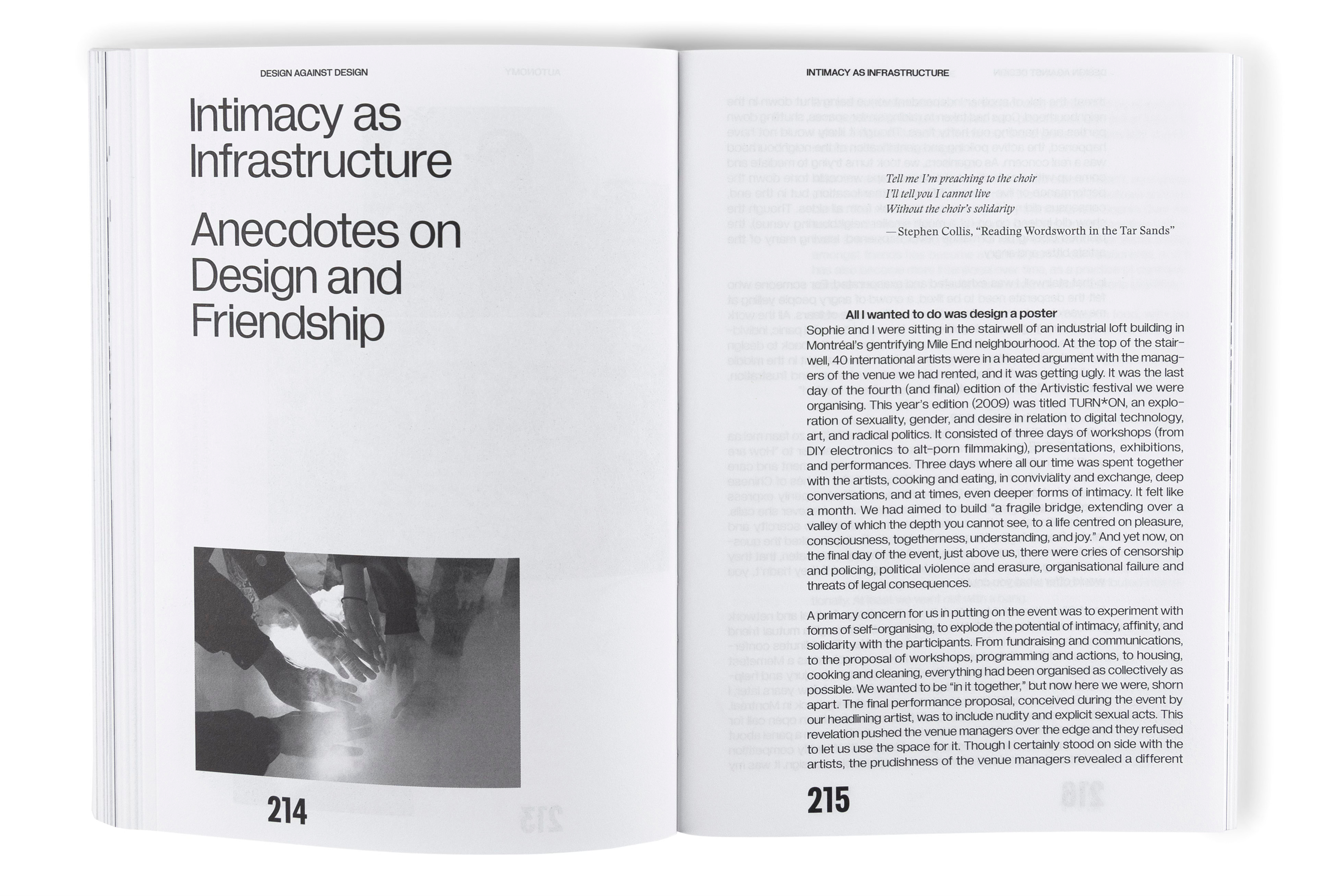
KYKL: Thanks so much for the generous insight into these designs. I think I’ve trapped you into writing an extended colophon! I appreciate the straightforwardness and practicality in how you describe the terms mentioned and your design process. And the analogy of the body shop vs. the idea cabinet is spot on, but if you’ll excuse the academic presumptuousness, I do still think there’s something deeper going on and quite a few threads to pull on.
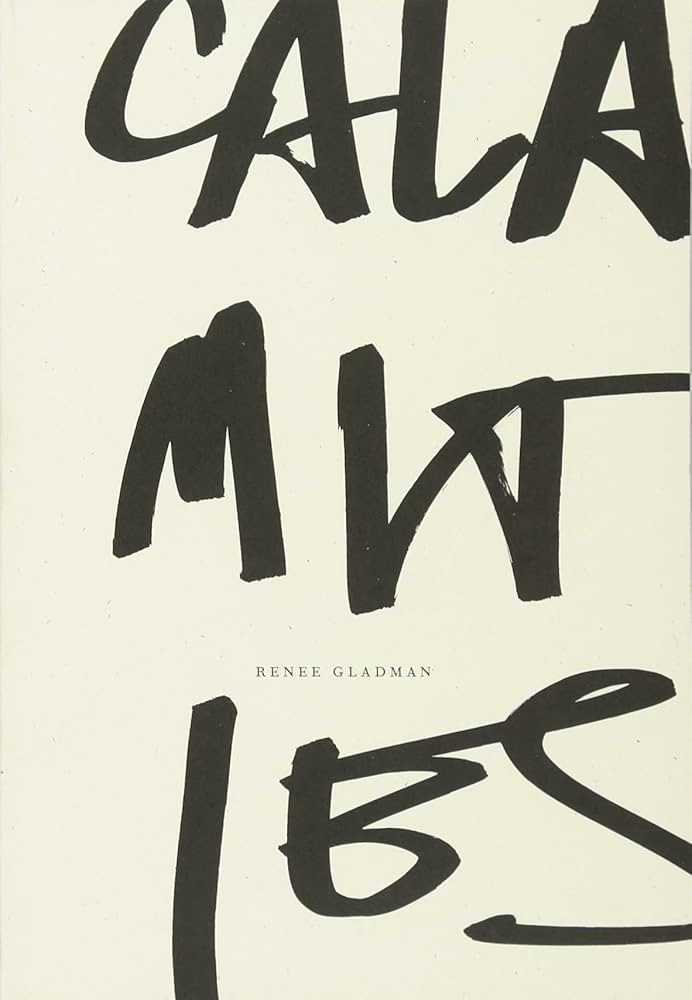
First of all, you describe the material constraints (cutting down cover costs and lack of an art budget) that guide the design. Of course this is true of all projects, and a good designer will take advantage of these opportunities, but you’ve done so in really striking ways. You’ve leaned into and highlighted the limitations. Wave’s signature is so forceful, it’s far from just novelty, the interpretive title treatments, concrete compositions, and paper selection are all acts of skilled design. Gladman’s Calamities cover is burned into my brain! And it’s just a masterfully executed scrawl. With Parapraxis, you could have argued for a less visual approach or sourced stock imagery given the limited art budget, but instead you’ve created a plethora of artwork, photography, collage, and re-photography for each issue that feels so raw and urgent and cohesive because the production constraints dictate that they have to be.
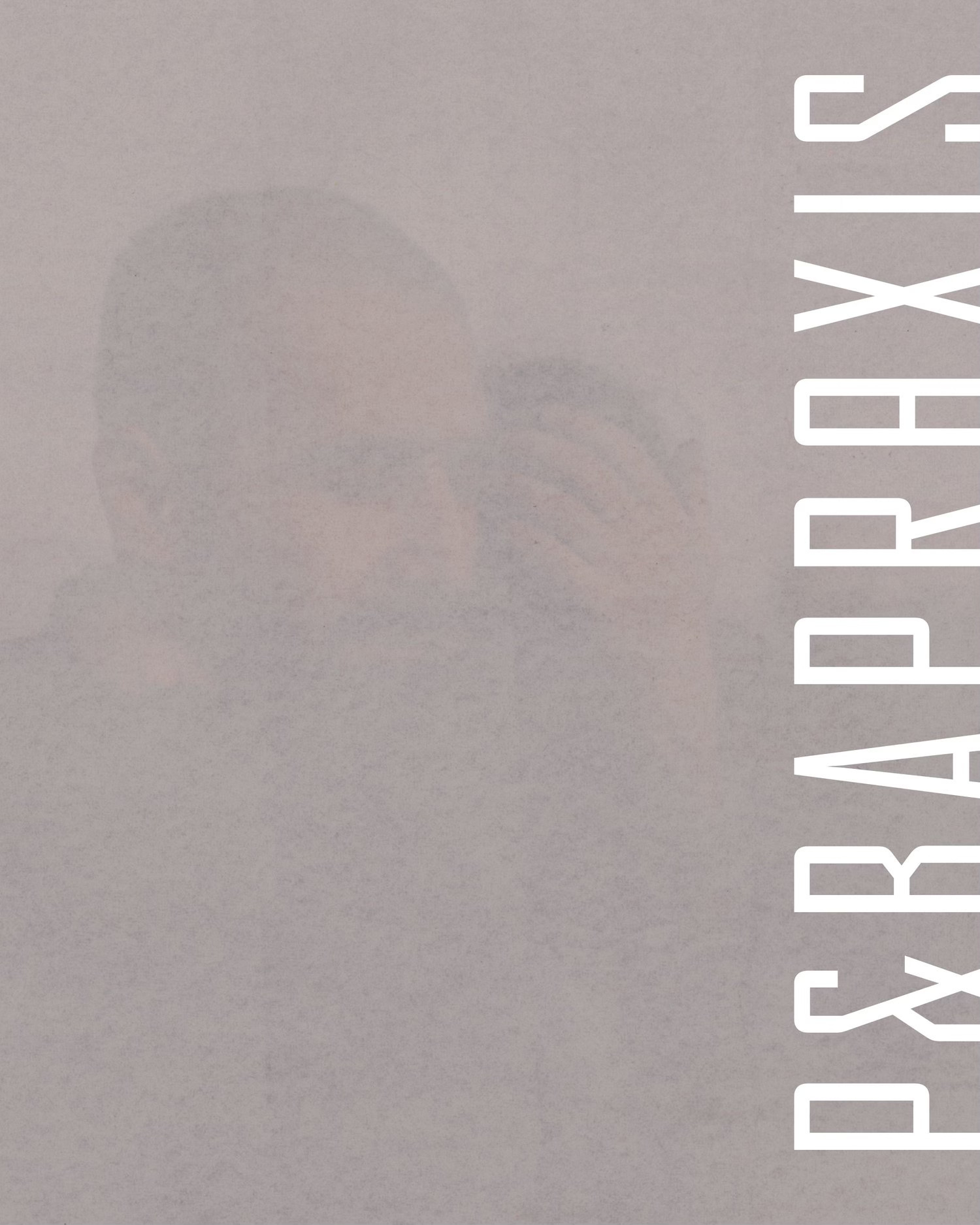
The second thread is that I think your specific way of dealing with these material constraints, of making them so evident and potent, is radical politically. The latest cover image for Parapraxis, with gauze overlaid onto an anonymous photograph of a man cradling his child or his lover’s head, resulting in a barely visible ghostly image, captures this painful moment so powerfully. But there’s no way a commercial publication would have let you get away with this level of literal opacity. And though that in itself might not make something political, it reads here as a clear positioning of the publication, far more than a condensed gothic sans thrown onto a masthead. The material qualities of the image (you didn’t just digitally drop the opacity slider) make it feel like an incitation instead of an object of contemplation. I feel this way about a lot of your work.
I’m not saying all this to throw you flowers. I’m trying to think through strategy (and pedagogy) here, and I feel there’s more going on than a workman-like approach of being appropriate to the content. Which leads to the third thread, coming from your insecurities of not knowing what the fuck you’re doing, of not going to design school. In my case as both student and teacher, I’d tell you that design school is probably not what you think it is. Type history is for the most part bland and boring, and in an interdisciplinary department like mine, is barely touched upon. The fact you can identify Agency as a 90s canonical font, and have some real feelings about it, speaks to a level of care towards our visual culture that I wish more professionally-trained designers would possess. And your trust in the editors’ instincts is also an act of care. And it's this level of care that sparked my thinking on the colophon in the first place. Is there a relationship between your self-doubt and your care?
Working through these ideas, my own type selection for Calico feels a bit pedantic. I’ve always found Dolly to be a warm, robust, and easy to use book face and given the multilingual nature of the publication, we needed something with an extensive character set (though the lack of Vietnamese support, like in most typefaces, is incredibly frustrating). I also wanted something that didn’t read as colonially British, American, or French type, not that the Dutch aren’t colonial bastards as well, but the lower contrast reads a bit differently somehow. And in a parallel vein, Dolly’s calligraphic roots felt like it could pair well with Arabic script, Chinese characters, or other written languages that maintain traces of the hand. So the choice was driven by practical concerns, but those concerns are also inherently ethical.
As for Gramatika in Design Against Design, it was driven by a conceptual critique of (or just an inside joke about) graphic design’s relationship to Helvetica. I was really fascinated by Gornitsky’s approach to the design, starting from identifying Helvetica as an idiosyncratic display face and then going through a complete deconstruction and reconstruction of the typeface and type design standards by applying an almost absurd level of rigorous rational measurement. I gave myself the challenge of using it to set the body text in a justified setting and about halfway through started really questioning myself, but it was too late at that point. I think I wanted to work against fluidity, I don’t think it’s a comfortable read, but I ended up feeling a bit ambivalent towards that goal in the end. And now I hope that ambivalence actually comes through. Pairing it with Stanley, which I do love as well, was another joke/critique, by essentially designing a “design” book with Helvetica and Times.
While writing these last paragraphs, I did a quick search and realized that Font Bureau, who released Agency, shut down in July, and there’s nowhere to license it anymore! I’m not sure what the story is behind this, but to me it makes your design feel even more prescient (and ghostly). It also makes me think of how both of us are dedicated to using Freight and Halyard, knowing what we know about Joshua Darden’s story.
Is this auto shop gossip or are we whispering in the cabinet now?
In my new role I’m doing some theoretical work on opacity these days, specifically around BIPOC aesthetics and political strategy, thinking against representation and visibility (DEI and tokenization and capitalization) and carceral systems (surveillance and racial capture). So I’m thinking about the stories and strategies we hold close, that a politics doesn’t need to always be declarative, but can also work towards building up a slow riot (to quote the title of the GY!BE album). I’d like to think this is what our collective work is doing, maybe visible only in small gestures and signals.
JC: I love that you changed your mind about Gramatika midway through laying out Design Against Design, but felt your only choice was to keep going. This is the story of my design life, too! I’ve wondered if what’s in play unconsciously is that I want control over the potential disapproval of my work—I need to be the first to feel it and explore it, and then I have to expel that self-doubt because there’s no time left for it if I’m going to meet a deadline.
And I think the Gramatika looks tight! I love the way you’ve sized and leaded it, and how its wild italics signal that as a designer you want to chauffeur us out to the edge of the permissible. The way it harmonizes—even sometimes with a pleasurable dissonance—with Stanley and Youth Grotesque and Syne Tactile is really deft. As for Gramatika and Stanley standing in for Helvetica and Times New Roman: I love that.
Yeah. Freight and Halyard (and Omnes and Corundum and Dapifer!). What a gift to discover great type designers who aren’t white boys from Europe, and while I was saddened to learn Darden probably isn’t around much anymore, I’m happy for him if it means a break from the liberal hipsterism and slick white commercialism of Designland.
“[T]hat a politics doesn’t need to always be declarative”—I love this, too. And maybe it’s our entrée into bringing up anarchism? The way we’re comfortable blending into backgrounds, not from fear but because we know it’s our numbers and anonymity, rather than our identities, that are crucial to praxis. Yet when we’re assembled in public we’ve clearly declared what we are, and we revel in that, too. GY!BE’s new album is called No Title As of 13 February 2024 28,340 Dead. They’re declining to title the album while also titling it, and in this non-title they’re numbering the murdered of Palestine.
Slow riots, small gestures, revivifying dead genres (the colophon), helping one another design more effectively, black clothes/black type: I want all of it, KLo. And I’m endlessly grateful we found each other. 🖤